Maps
Get the most out of your home screen maps.
Updated January 28, 2022
The map widgets available for home screen layouts can help you visualize what you have done in your field so far, and it's worth taking a moment to learn the ins and outs of what they are capable of.
If you're connected to WiFi, you can switch the background imagery on your maps widgets between a grid and satellite images.
Go to the WiFi setup page by tapping the speed and status bar in the top right of the screen, followed by 20|20 Cloud in the sidebar. At the bottom of that page, you'll see the two options listed under Map Background Style. Press the one you want to make active.
Table of Contents
Understand What the Map Is Showing
For all metrics except SRI, the 20|20 maps at five hertz, meaning that it adds five data points for each second that elapses. (SRI, by contrast, is mapped at two hertz.)
You can configure how wide a window you want to use for the running average used to calculate these data points in the Crops setup menu.
Data is mapped on a row-by-row basis, and inactive rows do not produce data, so they do not show up on the map. For example, if you have even rows turned off, and one odd row is failing but all the rest are working perfectly, you should see one red line in the middle of an alternating sequence of green and blank lines.
Features described in this article are available on all maps widgets except the Small size. Make sure to switch to the Standard or Large Map layouts, or add your own map widget to access these features.
Switch Map Layers
The map can only visualize one metric at a time, but that doesn't mean that there aren't other metrics available.
You can change which one is active by tapping on the metric name in the upper left corner of the map (the icon next to it should have three horizontal green lines). This will bring up a large, scrollable menu where you can select what you'd like to see.
Some map layers, such as Down Force, require specific Precision Planting hardware to be installed.
Understand What Map Layers Represent
When you’re switching between all the available layers, you may sometimes wonder just what each one means. Here’s a list to help you understand each map more clearly.
- Population maps the population rate for each individual row, in thousands of seeds per acre (K/ac).
- Singulation maps how well seeds are being singulated, i.e., planted one by one without missing a beat. Singulated seeds are mapped in green, Skips in red, and Multiples in blue.
- Insecticide maps the expected applied rate for each row with vDrive Insecticide.
- Vehicle Speed maps the planter speed as shown by the speed reading in the top right hand corner of the display. This map is planter-wide, not row-by-row.
- Row Speed maps the calculated speed for each row.
- Down Force maps the minimum weight measured from each load cell within the past fifth of a second. A blue stretch represents a loss of ground contact.
- Applied Down Force maps the commanded force in pounds for each row from the active Down Force system.
- Coverage maps which parts of the filed the implement has covered so far.
- Seeding Tank maps which meter is actively planting on each row for vSet Select and mSet.
- SRI maps each row’s Seed Release Index, which is a measure of how evenly spaced your planted seeds are, ignoring skips and multiples.
- <Liquid System> maps the applied rate in gallons per acre for each individual row. The names of these maps match the product nickname that was selected during setup in the Equipment menu.
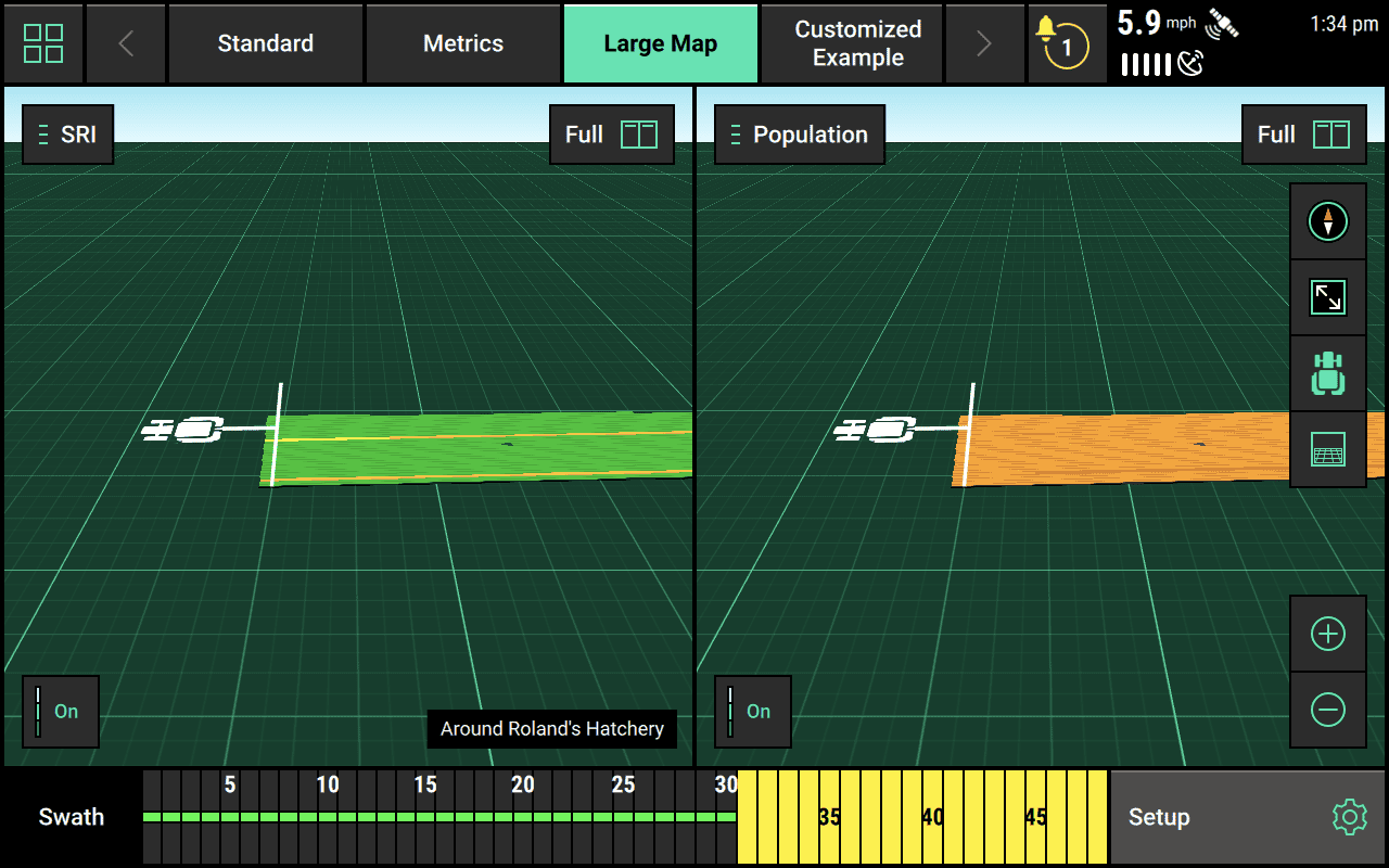
View Two Map Layers Side by Side
Sometimes you want to keep track of two layers but you don't want to keep switching between map layers. Thankfully, the 20|20 has you covered. In the top right corner of the map, you can toggle between Full screen and Split screen. In Split screen mode, you will see two versions of the same map side by side, each one showing a different metric (as illustrated below).
Show or Hide the Legend
By default, the map legend his hidden. You can show it by tapping the button in the lower left corner. It should say Off when the legend is visible and On when it is not (the label indicates what you are changing to).
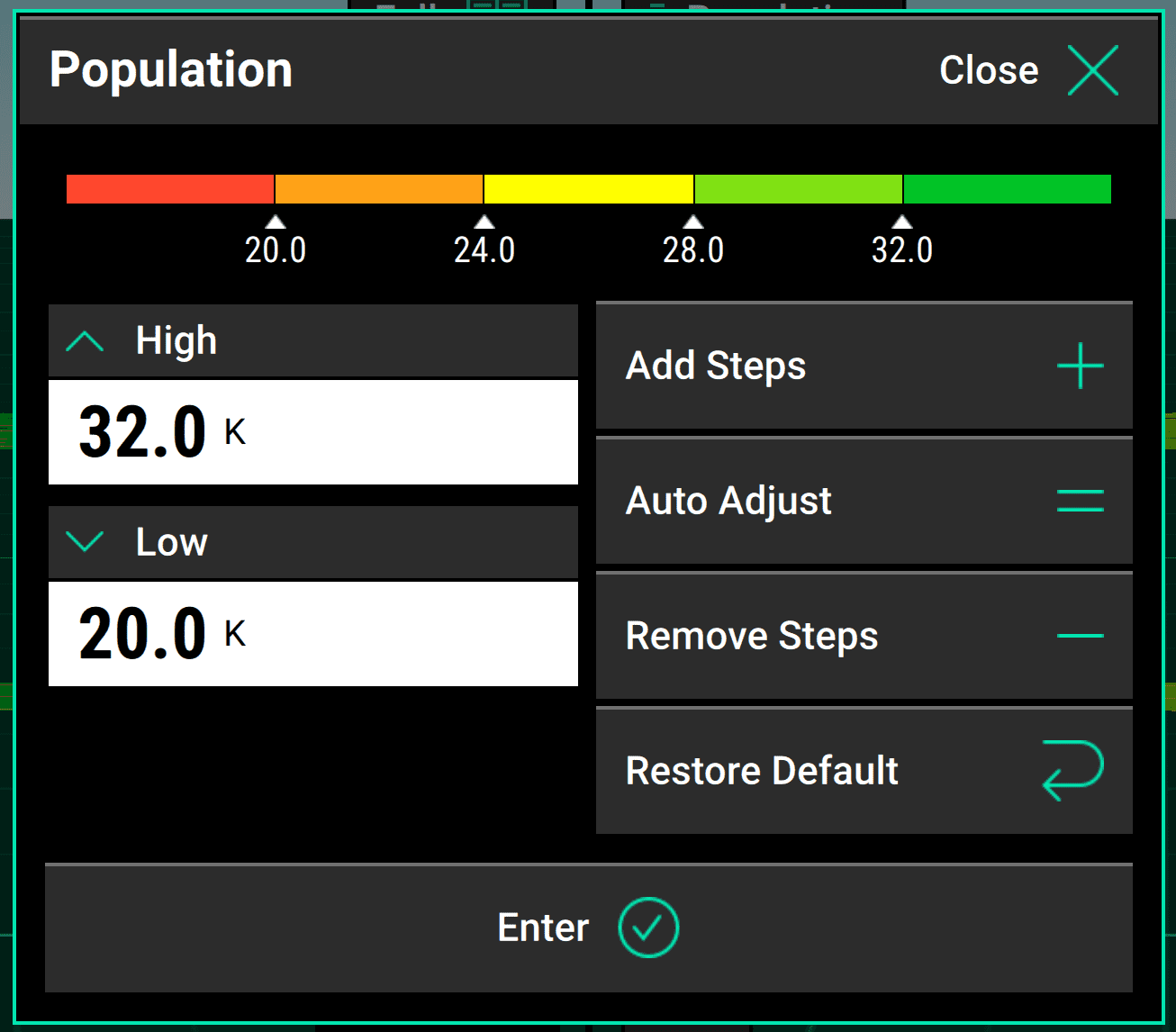
Adjust Legend Values
Once you have a legend visible, you can tap on it to adjust how many "steps" are included in the color gradations and what the high and low values should be.
For example, in the image below, there are currently four steps: 20.0, 24.0, 28.0, and 32.0. Tapping Add Steps twice would result in six steps: 20.0, 22.4, 24.8, 27.2, 29.6, and 32.0. As you can see, the top and bottom remain the same, and the range between them is just divided evenly to match the new step count. If you wanted to change the top and bottom number, you would adjust the High and Low values on the left. Alternatively, you can press the Auto Adjust to let the 20|20 decide how best to divide things up to match the data it is producing.
Change Orientation and Center of Map
You can use the set of four buttons on the right side of the map to change its orientation and focus.
Switch Between North-Facing and Implement-Facing Modes
The compass-like top button controls which way the top of the map is oriented. Pressing it repeatedly toggles between two orientation modes:
- North-facing mode (the default), where the top of the map is always north
- Implement-facing mode, where the implement always points toward the top of the screen and the map reorients itself as the implement turns.
Regardless of which mode you have on, the compass in the button functions as a real compass – the red end always points north.
Center the Map Statically on Existing Coverage
The second button down – an "expand" icon – expands and centers the map to include all of the field with coverage so far.
When you press this button, the map becomes static and does not move with the implement. However, a white arrow will appear pointing to your tractor location if it goes outside the map's boundaries.
Center the Map Dynamically on the Tractor
If you'd like to zoom in and center the map on the implement, you can tap the third button down (a tractor icon).
If you do this, the map will remain centered on the tractor, following it as it moves around the field.
Change Your Perspective on the Map
If you are connected to WiFi, you can view the map:
- from above, looking straight down
- from a 65-degree angle
- from a 75-degree angle
To switch among these options, tap on the bottom icon in the righthand list. It will look like a grid viewed from the angle of the next perspective you'd see if you pressed it.