Metrics Dashboards
Use metrics dashboards to understand and explore how each row of your system is performing in real time.
Updated January 28, 2022
If the widgets and maps on the home screen give you a quick overview of how your pass is going, the metrics dashboards let you dig deeper into the nitty-gritty of row-by-row performance.
You can access these dashboards by tapping on most metrics widgets, including the Dashboard Mini-Chart, which is really just a preview widget for the larger dashboard it links to.
Table of Contents
View Metric Performance Across the Implement
When you tap on a metrics widget, you’ll be taken to a dashboard for that metric, which shows how every row is performing, using a convenient bar chart. You can tap any individual bar to dig deeper and examine that row in isolation. More on that in the next section.
If you don’t have a widget on your home screen for a particular metric, you can just tap the Dashboard Mini-Chart at the bottom of the layout (if it’s there), and then scroll through the metrics in the sidebar to find the one you want.
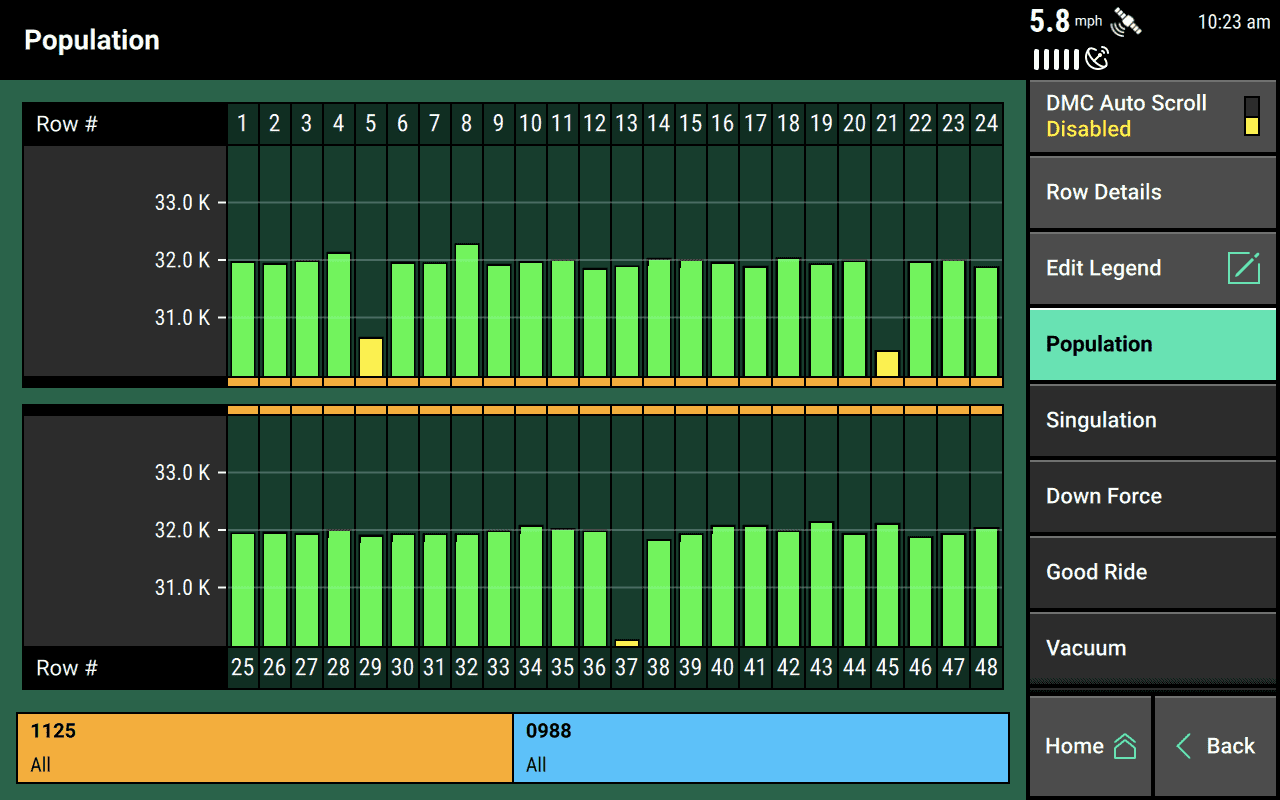
The chart follows the usual color-coding rules for the 20|20. If a row is performing poorly, it will be yellow or even red. If everything is performing as expected, it will be green.
Additionally you’ll notice one other use of color running along the bottom of the top half of the chart and the top of the bottom half. These colors represent the product that is being applied. If a row is colored, yellow, that means it is not applying anything. Otherwise, the color of the product corresponds to the colors you’d see on your Setup menu homepage.
For some metrics, you’ll be able to edit the upper and lower bounds represented by the chart. When that option is available, an Edit Legend button will appear in the sidebar.
Access Individual Row Details
If you’ve recognized a problem row, you may want to zoom in and see how it’s performing for all metrics at once. You can do that by either tapping on a bar in the bar chart discussed in the previous section, or you can tap Row Details in the metrics dashboard sidebar and then select the row you want to look at.
The Row Details page you’ll be taken to will show you all of the most important metrics for that row, each color-coded to guide your attention where it’s needed.
At the bottom of the page, you’ll also see a real-time animation that depicts each seed being planted.
This animation can give you a good visual feel for how the system is doing even if the numbers feel a bit abstract. Seeds that are properly singulated (planted separately, without missing a beat) will show up as green, while seeds that are doubled up be blue and expected seeds that don’t get planted will be red. If you see that your row is tending to put a lot of blue multiples down, you can know what to look for when you go troubleshooting it.
Add a Mini Dashboard to Your Home Screen
The Dashboard Mini-Chart is designed to give you easy access to these dashboards from your home screen. It is, as its name suggests, a miniaturized version of the full dashboard. And it’s available for all metrics that have dashboards.
By default, the 20|20 comes with a Dashboard Mini-Chart at the bottom of the Standard Layout, but you can also add one to other layouts. To change which metric it shows, tap on it, then use the sidebar to select the metric you want. When you go back home, you’ll see that the Dashboard Mini-Chart has changed to reflect your new selection.
But you’re not limited to only one metric for the mini chart. You can also tell the 20|20 to cycle regularly through several metrics. To set this up, tap on the Dashboard Mini-Chart on your home screen, then tap on DMC Auto-Scroll at the top of the sidebar. Now you can turn the auto-scroll feature on by pressing Enabled. At this point, you’ll want to configure two settings: how long the 20|20 should pause over each metric and which metrics you want it to cycle through. When you’re done, return home to see if you like the results.
In the video below, the 20|20 cycles through three metrics for three seconds each.
Jump to These Pages When a Row Fails
Since both the implement-wide metrics dashboard and the individual row details page are so useful when diagnosing poor performance, you may want to configure your 20|20 to show you them if something ever fails.
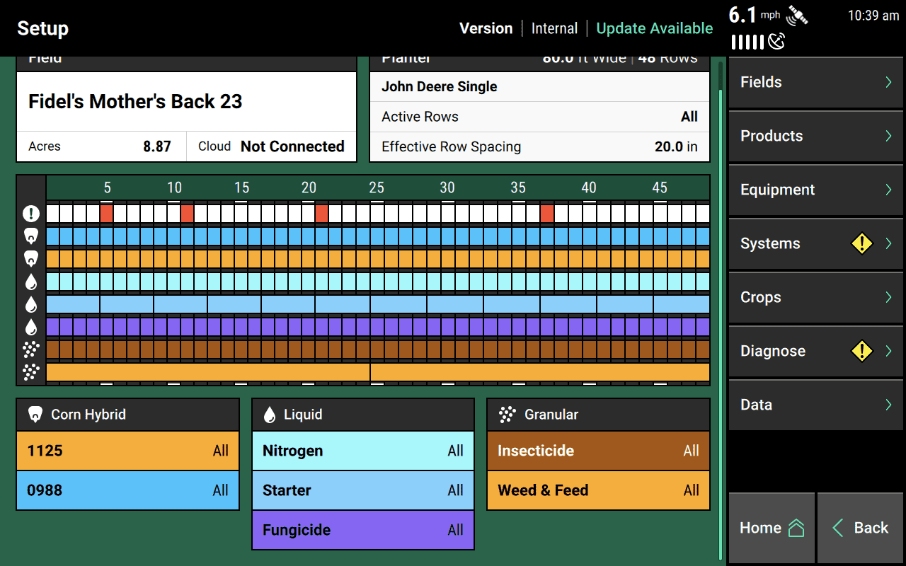
In the Crops setup menu, you can configure a Failure Action for most systems. Among the options for that setting, you’ll see one for showing the dashboard of the metric that failed (Jump to Bar Chart) and another for showing the row details page (Jump to Row Details). You can select an individualized failure action for each system.