Metrics Widgets
Find and understand all metrics widgets available on the 20|20
Updated January 28, 2022
Metrics widgets give you a quick look into how your systems are performing. This article will let you know which metrics come in widget form and what those widgets mean.
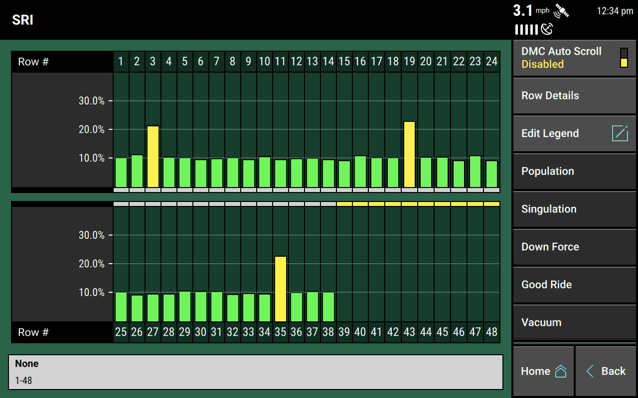
As a general rule, if you tap on a metrics widget, you’ll be taken to a row-by-row overview page for that metric, like the one pictured below. Some widgets behave a bit differently, though, and when that’s the case, it will be noted below.
Remember that widgets are often available in multiple sizes. The images in this article only represent the largest available widget, since they often contain the most information. But you should always check out other size options if your preferred layout needs a different size or shape.
Additionally, you will only be able to add widgets for systems that you have already added in the Equipment setup menu. If you don’t see a widget listed on this page in your 20|20, it’s because you need to add it there
Table of Contents
Anatomy of an Extra-Large Metrics Widget
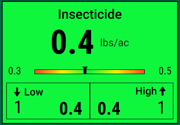
Extra Large widgets contain the most information, and they usually look pretty similar. So by familiarizing ourselves with them, we can get a pretty good understanding of how widgets organize and display metrics information.
The first thing to notice about any widget, no matter its size, is its color. As elsewhere in the 20|20, this color reflects the health of the system: Green is good. Yellow is starting to become a problem. And red is a problem that needs to be addressed. You can adjust the thresholds for these colors on a metric-by-metric basis by going to the relevant system in the Crops setup menu.
Generally, extra-large widgets are split into three parts:
- A large, bold number at the top represents the average for that metric across all rows.
- A rainbow chart visualizes how each individual row relates to the average. Each row is represented by a small arrow, and the average by a black line through the chart. The further away a row is from green, the worse that row is doing in terms of this metric.
- A two-column chart with Low values on the left and High values on the right. These help you see more clearly the full range of your implement’s performance. Within each box, you’ll see the row number (outside edge) and the metric value at that location (inside edge).
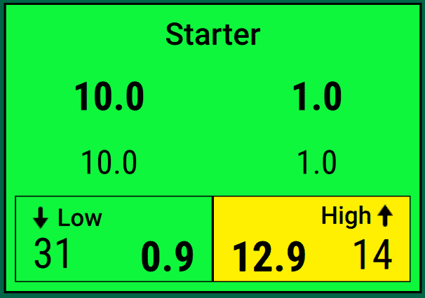
When you’re applying at different rates in multiple sections, though, you may see parts 1 and 2 replaced with a pair of numbers, representing the two rate sections.
If you are planting with two rate sections, they will show up separately in the widget, as shown here, and the rainbow chart will disappear.
Seeding System Widgets
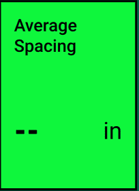
Average Spacing
The Average Spacing metric tells you how far apart seeds in the trench are, on average. It is calculated by dividing a number of seeds planted by the distance traveled while planting them.
It is not an indication of spacing accuracy. For that, you should look at the SRI widget.
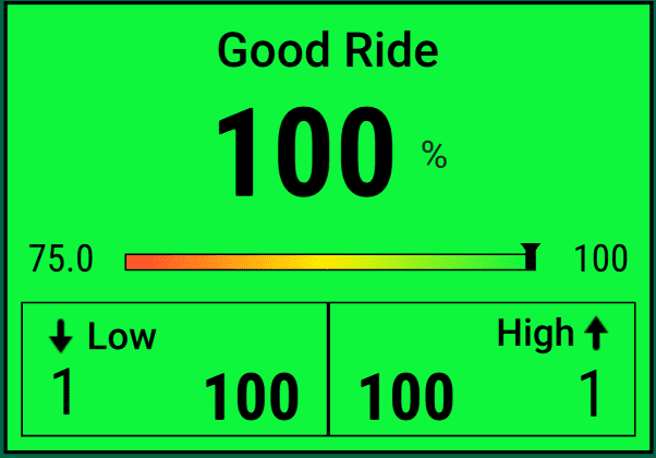
Good Ride
The Good Ride metric tells you how smoothly your implement is traveling over the soil. More specifically, it tells you the percent of time when the ride is smooth enough not to interfere with seed spacing.
You should review this in tandem with the SRI widget. If the SRI is high (not good) and the Good Ride is low, then you should consider slowing down to improve both metrics and get more even seed spacing.
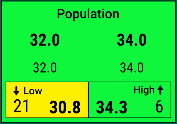
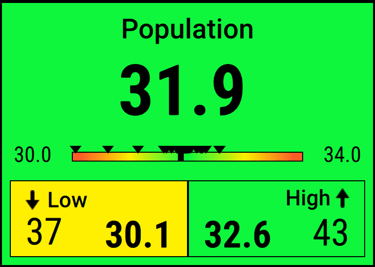
Population
The Population widget tells you how much seed you’re planting per acre. That’s not a running total, though. It’s an extrapolation from your current seeding pace. Essentially, the 20|20 looks in each row to see how much seed you’re planting per square inch, averages that across all rows, and then tells you how many seeds you’d end up planting in an acre if you kept planting at exactly that pace.
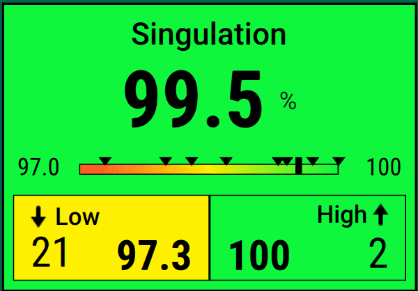
Singulation
The Singulation widget lets you know how your meter is performing. It tells you what percentage of seeds are being properly singulated, i.e., planted one by one without missing a beat. So, for example, a singulation rate of 99.5% means that the meter is planting 0.5% of seeds as either multiples (more than one seed in a single spot) or skips (no seed where there should be).
When your seeding rate is above 45 seeds per second, the Singulation widget will always display a value of --
See the Skips & Mults widget for the flip side of this one.
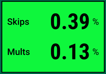
Skips & Mults
This widget is the flip side of the Singulation widget. Instead of focusing on the success rate, it breaks down the failures into two categories:
- multiples (Mults), where more than one seed has been planted in the same spot
- Skips, where no seed was planted in the expected spot
Both values are given as percentages of the total planted seeds. Lower values are naturally better.
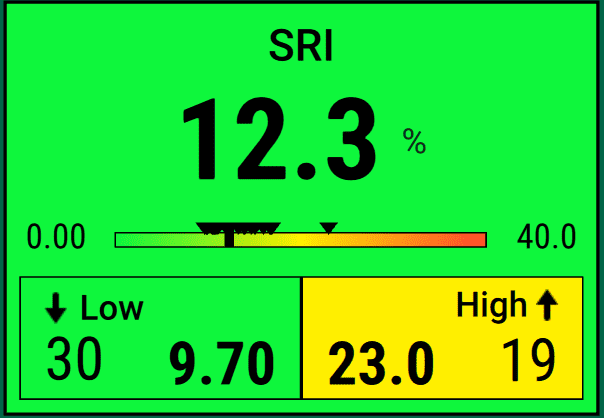
SRI
The SRI widget shows your current Seed Release Index, which is a measure of how evenly spaced your planted seeds are, ignoring skips and multiples. Lower values are better, since they mean more consistent spacing.
Theoretically, a 0% SRI would be perfect — every seed is exactly where it should be relative to its neighbors. At the other extreme, if your SRI gets above 32%, that means that your seeds are so erratically spaced that their placement can effectively be considered random.
By default, this widget will turn yellow when the SRI gets above 20%, which is where SRI starts to have negative agronomic implications. But you can adjust that threshold, as with all metrics alerts, in the Crops setup menu.
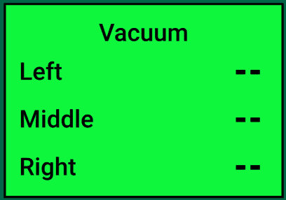
Vacuum
The Vacuum widget displays the readings from vacuum sensors connected to SRMs. In keeping with the 20|20’s three-part implement model (think of the three section switches on the Cab Control Module), the widget display values for the Left, Middle, and Right sections.
Down Force System Widgets
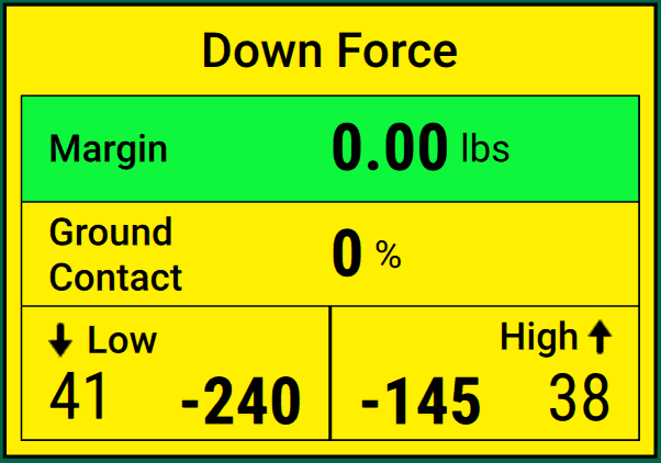
Down Force
The Down Force highlights the key metrics of how your Down Force system is performing:
- The Margin takes the lowest load cell reading in the last five seconds from each row and averages it across the whole implement.
- Ground Contact estimates the percentage of time the system was planting at the desired depth. In practice, that means the percentage of time where the load is at least 20 pounds.
- Low tells you the lowest weigh-pin reading on a single row, while High tells you the opposite: the highest weigh-pin reading on a single row.
Liquid and Granular System Widgets
This is really a family of widgets, each representing one of the liquid or granular systems you have on your implement.
The names of these widgets will depend on the “product” nicknames you chose to represent your systems when they were added in the Equipment setup menu.
In general, they simply tell you the rate at which that system is applying product.
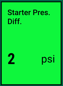
Pres. Diff.
This widget tells you the pressure differential between the inlet and outlet of the filter on the liquid system it belongs to.
As with other liquid system widgets, this will have a different name depending on how you set the system up.

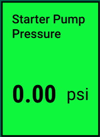
Pump Pressure
This widget tells you the pressure that the system is applying liquid at.
As with other liquid system widgets, this will have a different name depending on how you set the system up.
Remaining
This is actually a pair of two widgets, both of which are based on your Tank Mix settings. They let you know how much liquid you have remaining in your tank, either in terms of volume or in terms of how much acreage that volume can cover.
As with other liquid system widgets, these have different names depending on how you set each system up.
Soil Sensing System Widgets
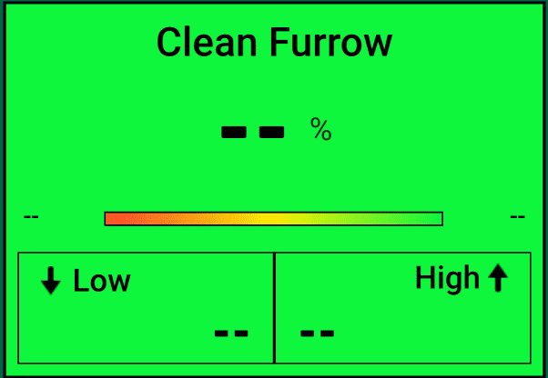
Clean Furrow
The Clean Furrow widget tells you what percentage of your furrow is “clean” — i.e., free of crop residue — according to SmartFirmer data.
Higher is better, and you should try to stay above 95%.
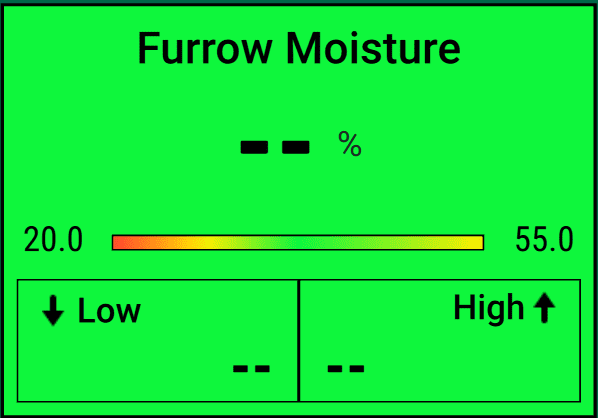
Furrow Moisture
This button displays the three day seed weight percentage of the moisture of the furrow as measured by SmartFirmer. Range is from 0 – 60% with a goal of 20% or higher.
Higher is better, and you should aim to stay above 20%. (60% is the maximum possible.)
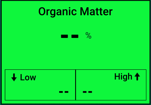
Organic Matter
The Organic Matter widget estimates the percentage of Organic Matter in the soil, according to SmartFirmer data. The maximum is 60%, but SmartFirmer is most accurate if this value stays within the 1% to 5% range.
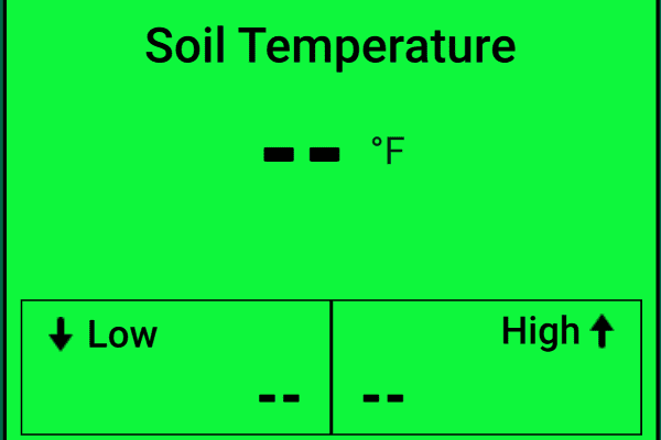
Soil Temperature
This SmartFirmer metric provides a real-time soil temperature reading. Temperature readings can range from 32°F to 100°F (0°C to 38°C).
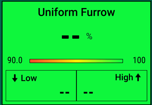
Uniform Furrow
The Uniform Furrow widget tells you what percentage of your furrow is “uniform” — i.e., consistent in terms of light, cloddiness, moisture changes, etc. — according to SmartFirmer data.
Higher is better, and you should try to stay above 95%.
Depth System Widgets
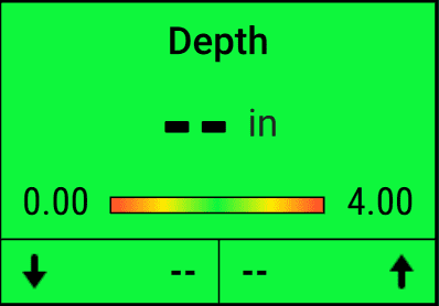
Depth
The Depth widget shows how deep your seeds are being planted, on average.
Closing System Widgets
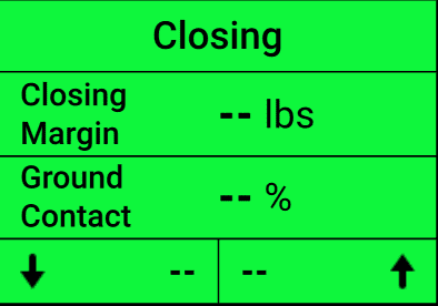
Closing
The Closing widget highlights the key metrics of how your Closing system is performing:
- The Margin takes the lowest load cell reading in the last five seconds from each row and averages it across the whole implement.
- Ground Contact estimates the percentage of time the closing stitching wheels are engaged with the ground.
- Low tells you the lowest weigh-pin reading on a single row, while High tells you the opposite: the highest weigh-pin reading on a single row.
Row Cleaner System Widgets
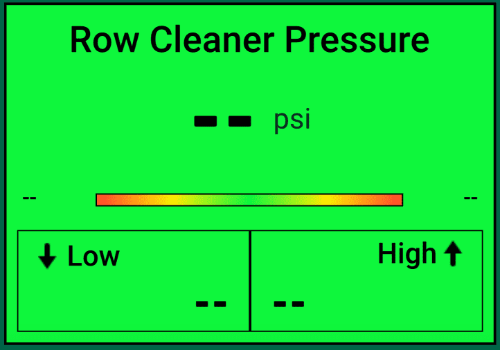
Row Cleaner Pressure
The Row Cleaner Pressure widget shows you the current pressure applied by your Row Cleaner modules. If the value is negative, that means the pressure is lifting upwards. If the value is negative, the pressure is pushing downwards.
General Purpose Widgets
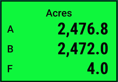
Acres
The Acres widget tells you how much land you have covered, using three counters: A and B are manually resettable, a bit like car odometers, while F gives your coverage so far in the currently active field.
Tap on the widget any time to go to the Counter Details page, where you can reset the A and B counters whenever you like.
In smaller versions, individualized A, B, and Field Acre counter widgets are available as well.
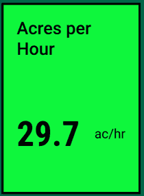
Acres per Hour
The Acres per Hour widget shows how many acres you can cover in the next hour, given your current speed.
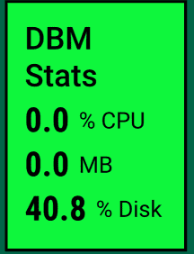
DBM Stats
The DBM Stats metric gives you some basic facts about your Display Base Module:
- how hard the processor is working at the moment (% CPU)
- how much memory (RAM) is currently being used (MB)
- how much of the total disk space is used and unavailable (% Disk)
Diagnose
The Diagnose widget gives you a quick overview of your implement health. It is color-coded according to the most serious diagnose status among your systems.
Tapping it will take you directly to the Diagnose menu so that you can address any issues.

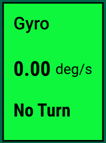
Gyro
The Gyro metric tells you about the turn your implement is making, specifically its radius in degrees per second. This measurement is used for turn compensation to ensure that outer and inner rows keep applying the expected amount of product even when they are moving at different speeds.